Timeseries prediction with XGBoost
![]()
XGBoost is undoubtedly one of the most popular algorithm in ML and Kaggle. It is no surprise if one of Kaggle’s Grandmasters, Bojan Tunguz, posted a while back this:

What is XGBoost
XGBoost stands for Extreme Gradient Boosting. More specifically, XGBoost is a decision-tree based ensemble ML algorithm that uses gradient boosting.
A nice article about XGBoost is this
XGBoost can be used for many cases, from regression to classification problems.
In this post I will use XGBoost for predicting the Close value of the Apple stock by using historical data. I will then predict a number for each day of the test data. This will be then a regression problem.
XGBOOST FOR REGRESSION
We will import some libraries such as pandas for data manipulation, pandas_datareader to grab the live data for the Apple stock, visualization libs like matplotlib and seaborn and finally from the XGBoost lib, we will import the XGBRegressor.
import pandas as pd
import pandas_datareader as pddr
import datetime as dt
import matplotlib.pyplot as plt
import seaborn as sns
from xgboost import XGBRegressor as xgbreg


import warnings
warnings.filterwarnings("ignore")
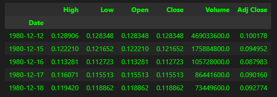
Let’s grab the data for the Apple stock from 1980.
start_date = dt.datetime(1980, 1, 1)
end_date = dt.datetime.now()
stock_sticker = 'AAPL'

df = pddr.DataReader(stock_sticker, 'yahoo', start_date, end_date)
Let’s have a peak at the data
df.head()
df.tail()
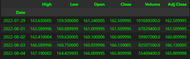
The data dates back from December 1980 till yesterday (time of this post).
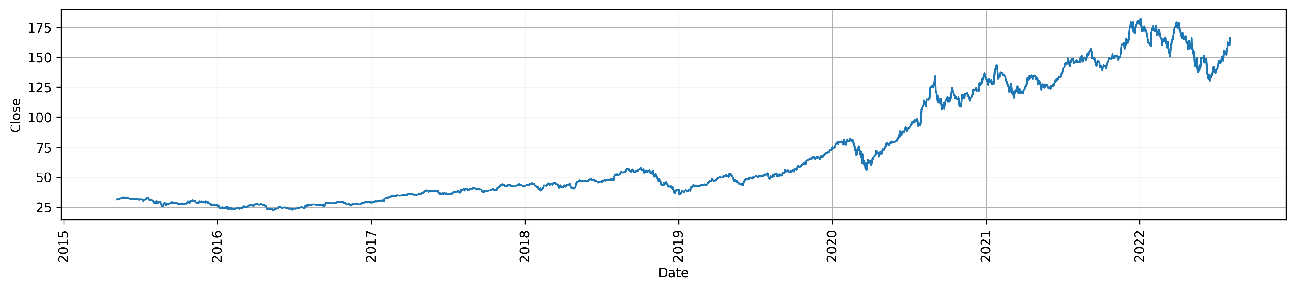
Let’s visualize some of the data:
plt.rcParams.update({'figure.figsize': (17, 3), 'figure.dpi':300})
fig, ax = plt.subplots()
sns.lineplot(data=df.tail(1825), x=df.tail(1825).index, y='Close')
plt.grid(linestyle='-', linewidth=0.3)
ax.tick_params(axis='x', rotation=90)
When working with timeseries, you want to split the data between training and test. Normally from the data obtained, we decide a cut-off date, from where the test data will be taken. Data prior to that date will be the train data. Let’s do that:
data_split = '02-01-2022'
train_data = df.loc[df.index < data_split]
test_data = df.loc[df.index >= data_split]

fig, ax = plt.subplots(figsize=(15,5))
train_data['Close'].plot(ax=ax, label='Train data', title="Data split")
test_data['Close'].plot(ax=ax, label='Test Data')
ax.axvline(data_split, color='black', ls='dotted')
plt.show()
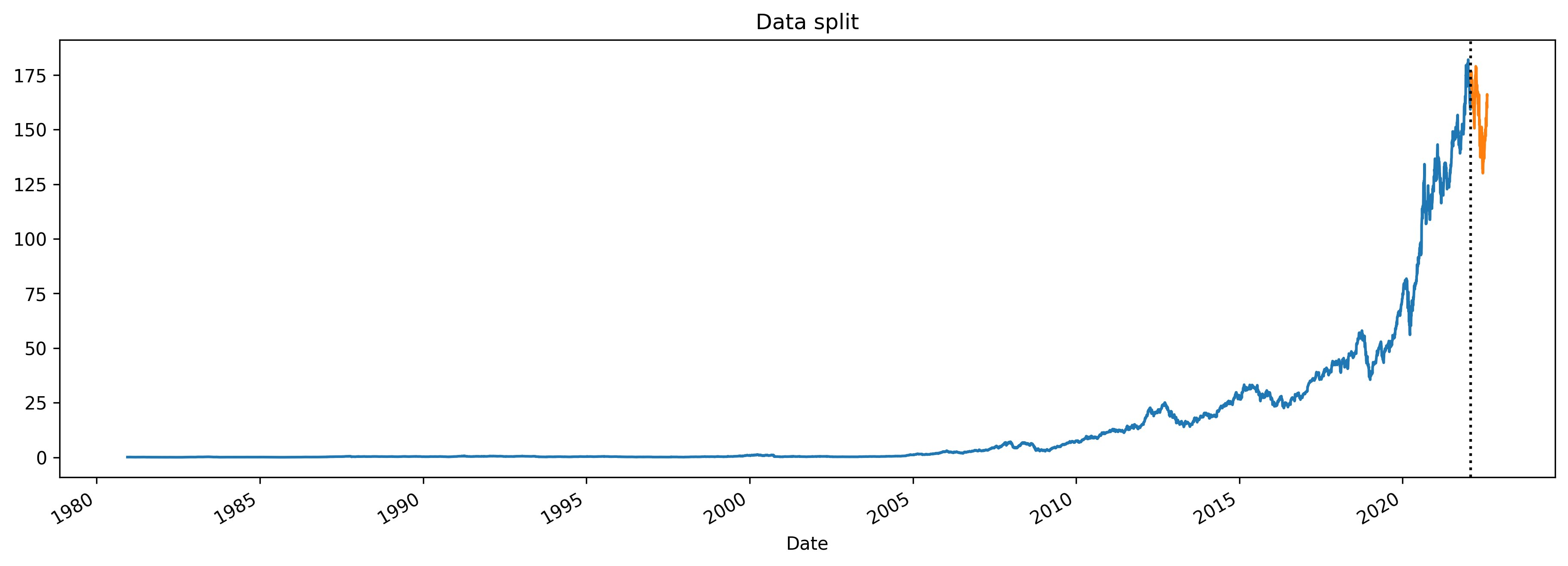
The blue line is the train data and the orange one is the test data.
Creating features
The dataset has quite good features such as High, Low, Open and Volume but we can create more features by utilizing the Date and get additional features such as day of the week, index of the month etc.
def create_features(df):
    df.copy()
    df['dayofweek'] = df.index.dayofweek
    df['month'] = df.index.month
    df['year'] = df.index.year
    df['dayofyear'] = df.index.dayofyear
    return df

FEATURES = ['Open', 'High', 'Low', 'Volume', 'dayofweek', 'month', 'year', 'dayofyear']
TARGET = ['Close']
train = create_features(train_data)
test = create_features(test_data)
X_train, y_train = train[FEATURES], train[TARGET]
X_test, y_test = test[FEATURES], test[TARGET]
Here we created the features and target (Close). Then we created for both train and test data the X (Features) and Y(Target). Now to the model.
Model
model = xgbreg(n_estimators=2000,
                learning_rate=0.01,
                max_depth = 5,
                max_bin = 8192,
                predictor = 'gpu_predictor',
                objective = "reg:squarederror",
                early_stopping_rounds = 50,
                tree_method='gpu_hist'
                )
In this case I have decided to take advantage of the tree_method gpu_hist, so that the model can run on GPU. Without setting this up, XGBoost would run on CPU and be slower when training.
When testing out, higher accuracy was achieved when increasing the bin value.
For this model I then set the early_stopping_rounds to 50. This basically means that the model will stop training if for 50 consecutive runs there is no improvements with the objective (squared error), this is to avoid overfitting. However, you will see the results later that are quite close to real data, which makes me think if the model overfit anyway…
Training
model.fit(X_train, y_train,
        eval_set=[(X_train, y_train), (X_test, y_test)],
        verbose=True
        )
The model ran for 1973 rounds instead of 2000 set. This is thanks to the early stopping feature.
Now that the model trained, we can fit the test data and get predictions.
Then we can merge the predictions with the dataframe.
#Predict
test_data['predictions'] = model.predict(X_test)
#Merge
df = df.merge(test_data[['predictions']], how='left', left_index=True, right_index=True)
Below are the predictions plotted along with the original data. Yellow is the prediction.
ax = df[['Close']].plot(figsize=(15,5))
df['predictions'].plot(ax=ax, style='.')
plt.legend(['Ground Truth', 'Predictions'])
ax.set_title('Predictions')
plt.show()
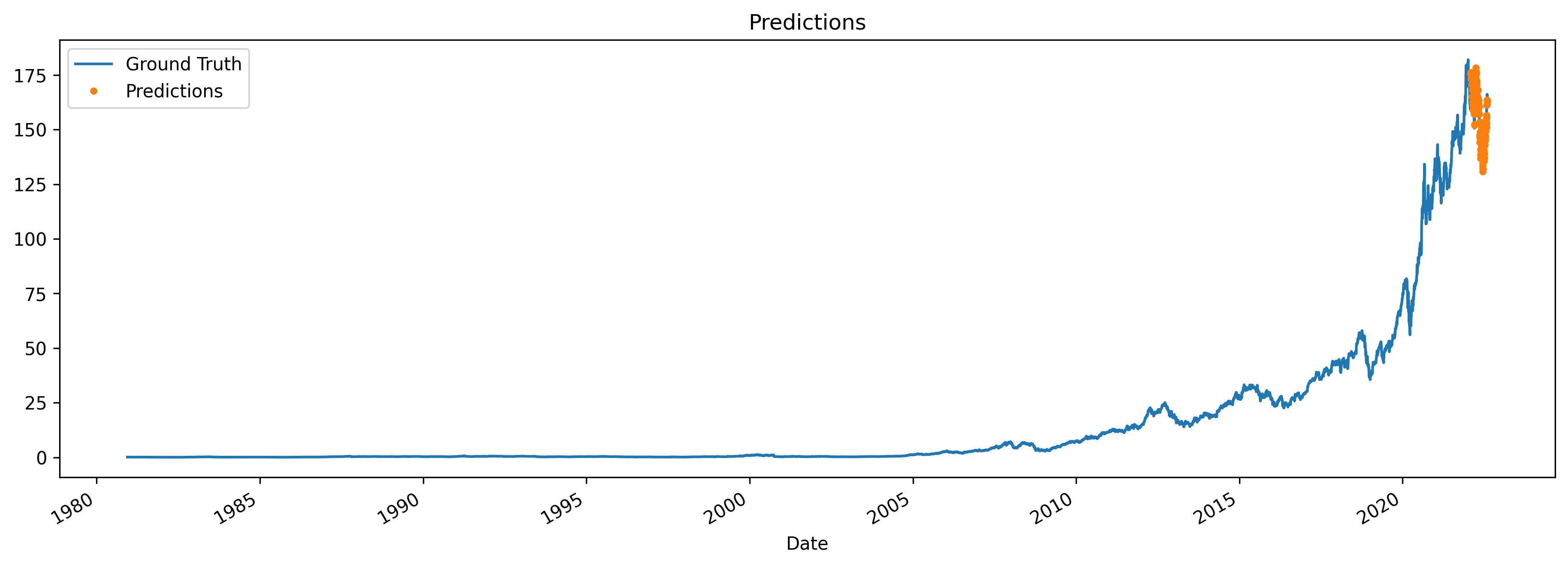
It is not so clear since the graph is so small so let’s focus only on the test data portion and see how accurate the predictions are.
ax = df.loc[(df.index > data_split) & (df.index < dt.datetime.now())]['Close'] \
    .plot(figsize=(15, 5), title='Week Of Data')
df.loc[(df.index >  data_split) & (df.index <  dt.datetime.now())]['predictions'] \
    .plot(style='-')
plt.legend(['Ground Data','Prediction'])
plt.show()
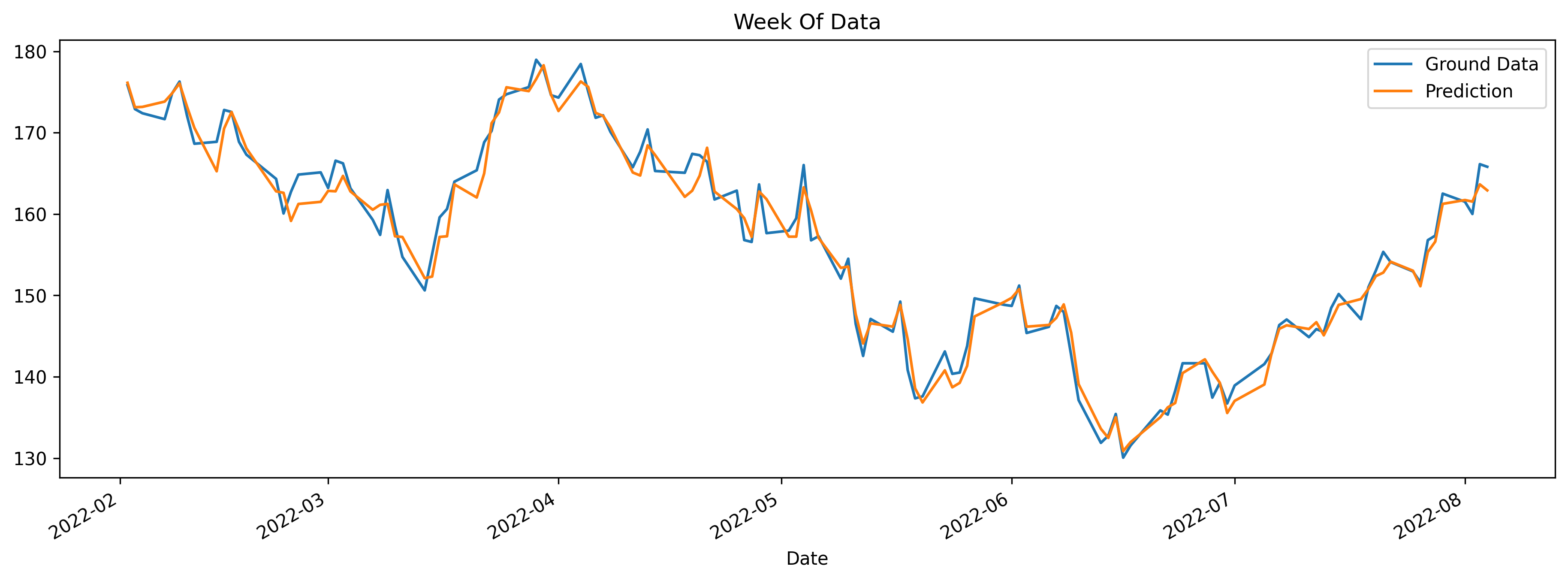
The yellow line (Predictions of Close) is not exactly overlapping the blue line (actual data) but it kind of follows the trend. These are just predictions and if it was so easy to predict stock prices, anybody would become rich :)
Exploring the predictions
Now that we have the predictions, why not having a look at them and see where the model performed better and worse.
First we can calculate the difference between actual vs predicted values and get the absolute value, just to see how far off they were.
df['Absolute_diff'] = df.apply(lambda x: abs(x['Close']- x['predictions']), axis=1)

#Group by month and count how many are having a difference over 1
df.loc[(df.index > data_split) & (df.Absolute_diff > 1)].groupby(['month'], as_index=False)['Absolute_diff'].count()
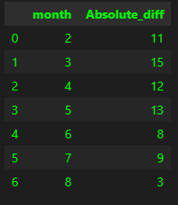
Looks like March was the worst of the months in terms of predictions. August, as it is still running at the time of this post, we can ignore. What was the best month, having a diff below 1 then?
df.loc[(df.index > data_split) & (df.Absolute_diff < 1)].groupby(['month'], as_index=False)['Absolute_diff'].count()
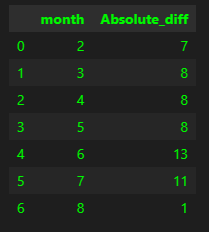
Seems like June was the one with the highest count (better accuracy). Let’s have a look at the June data then!
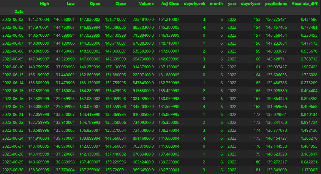
You can see that some predictions are very close to the actual Close value. Surely it would be more interesting to see in which occasions the model actual predicted the right trend, if for example the close value went higher or lower accordingly. For example on June 2nd and 3rd the value went lower, so did the predictions.
FEATURES IMPORTANCE
One important aspect of the trained model is to verify which of the features actually were used by the model when training. This can be easily done in few lines of code:
fi = pd.DataFrame(data=model.feature_importances_,
             index=model.feature_names_in_,
             columns=['importance'])
fi.sort_values('importance').plot(kind='barh', title='Feature Importance')
plt.show()
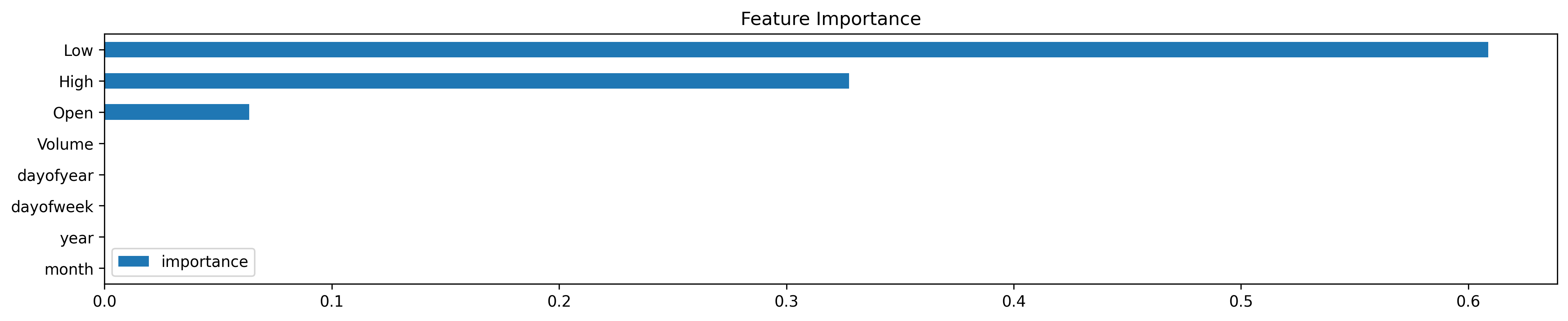
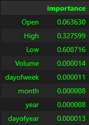
Looks like the most relevant features used were Low, High and Open. Volume and the time wise features were not really considered.